Applied AI Work: Using AI to accelerate production without outsourcing the design decisions
Audience research, information architecture, wireframing, and structural decisions came first. AI reduced the production effort required to turn an established design direction into a stakeholder-ready visual comp.
Princeton’s Keller Center Design for Impact (DFI) program helps faculty and researchers translate academic research into real-world impact, with participants eligible for up to $50K to explore those pathways. When I was asked to design the program’s web pages, I followed my usual process for any new digital property, with one addition: using AI to accelerate the final step.
My process
Before I sketch anything, I ask stakeholders to brainstorm audiences and scenarios in a simple format: a [type of person] is coming to [do what?]. For DFI, that produced examples like:
- An engineering professor coming to find out if his project is eligible
- A psychology researcher coming to learn the Fall 2026 deadline
- A humanities faculty member coming to apply for the program
I supplement whatever stakeholders provide with AI-generated examples to round out the set, then use AI to help analyze the fuller list for patterns and commonalities. That analysis is what actually drives the design — it surfaces which features and content the page needs. From there, I mentally architect how the page should work before ever opening a design tool.
I built the initial concept as a low-fidelity wireframe in Balsamiq, which kept stakeholder conversations focused on structure and flow rather than color and polish — and let me build working links between wireframe pages for early usability testing, before a single pixel of real visual design existed.
Where AI came in
Once the structure was validated, I used AI tools to move from the low-fidelity wireframe to a higher-fidelity visual — something I could put in front of stakeholders that actually looked and felt like the finished page. The audience research, the pattern analysis, the information architecture, and every structural decision were mine, made at the wireframe stage. AI accelerated turning a decision I’d already made into something to which stakeholders could react.
Before / after
Comparing the wireframe to the finished comp across both DFI pages, the pattern is consistent: structure, section order, and even core argument content (like the program’s three-part excellence framework) were already right at the wireframe stage and didn’t change. What changed was everything AI accelerated:
- Lorem ipsum sections became real, specific written content throughout
- My own working notes to myself and stakeholders — handwritten directly on the wireframe — were resolved into clean, labeled placeholders instead of just disappearing
- Generic placeholder boxes became specifically labeled ones, so anyone picking up the file later knows exactly what’s still needed
- Video callouts and other placeholder captions became specific and presentation-ready
Landing page
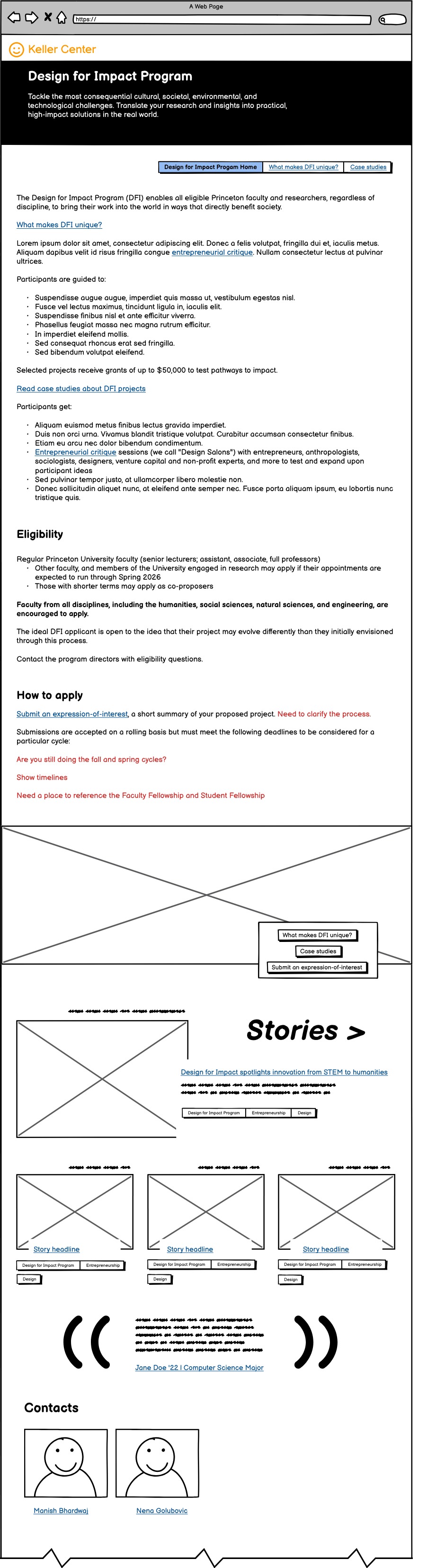
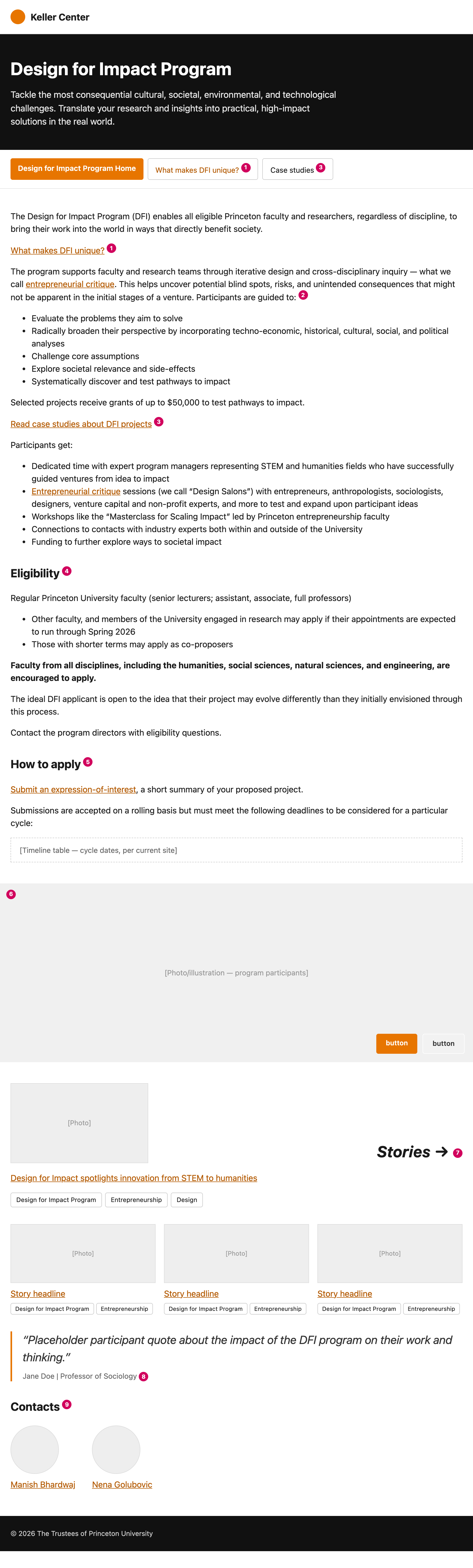
“What makes DFI unique?” page
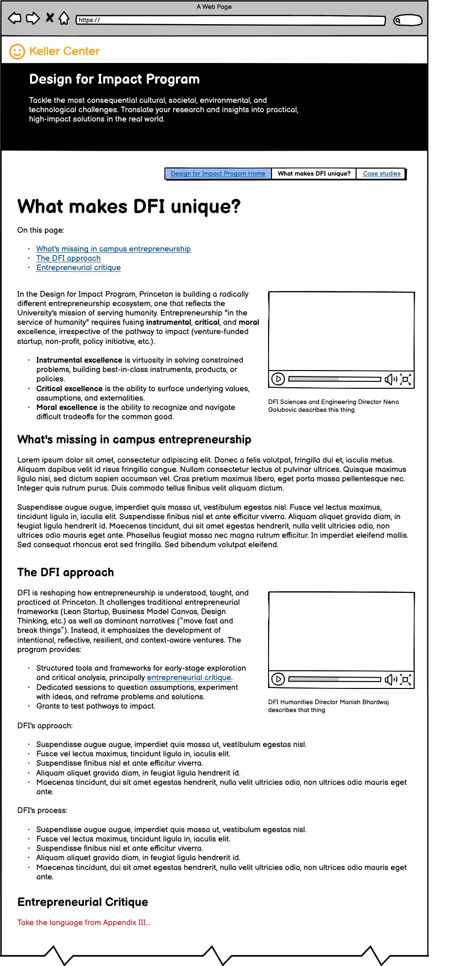
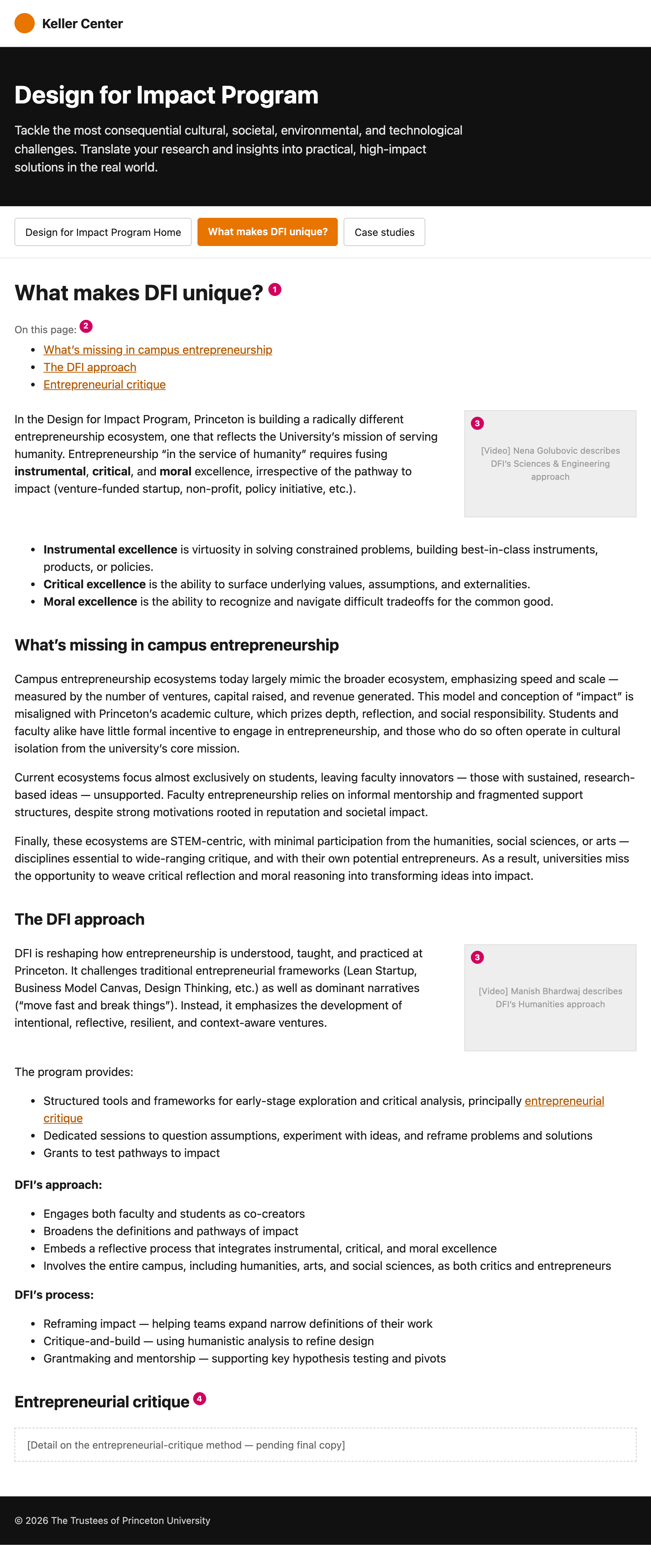
What this demonstrates
- Disciplined use of AI inside an existing design process — accelerating production, not replacing the thinking that came before it
- Structural and argumentative decisions that hold up unchanged from rough wireframe to finished comp
- Moving a stakeholder conversation from concept to reaction-ready faster, without cutting any of the research or reasoning behind it